Growth-minded agents
The bullseye includes women in their 40s and 50s. The identity stays broad enough for every capable agent, team, and brokerage.


Brand guidelines · v1.2
HomepageThe brand in one exchange
The answer, the recommendation, and the whole idea. A listing-production studio for real-estate agents—with enough personality to be remembered.
Brand essence
The answer01Foundation
The bullseye includes women in their 40s and 50s. The identity stays broad enough for every capable agent, team, and brokerage.
Not one clever editing trick. The listing, direction, versions, approvals, disclosures, and final marketing stay together.
Look exceptionally prepared without turning production work into another full-time job.
No shared character, palette, naming, product language, or hidden brand family. Distinct means distinct.
02Identity


Use the full wordmark whenever it fits. The plain EM is the pressure-release valve for compact and conservative placements.
Never use both together. No ring, portal, orbit, underline, blue line, hat, wand, or sparkle belongs in the logo.
Clear space: one cap-height around the wordmark. Minimum screen width: 120 px for the wordmark, 24 px for EM.
03Color
The newest system is crisp and clean first. Porcelain carries the workspace, white carries cards and panels, lavender-gray adds quiet structure, Blackberry carries language, and Hot Pink marks the action. Cream is occasional only.
#FAF9FBCrisp Porcelain#FFFFFFWhite#F3F0F5Pale lavender-gray#DDD7E2Soft plum-gray#160D24Blackberry#FF2D9BHot Pink#FFF4DFOccasional branded moments onlyPhotography or clean light first, with Blackberry for contrast and Hot Pink for the reveal.
Porcelain workspace, white panels, lavender-gray structure, decisive pink action.
Cream is an occasional branded moment only. The app uses Porcelain for the workspace, Paper White for cards, pale lavender-gray for grouping, and soft plum-gray for structure.
04Typography
Weight 700–800. Sentence case. Tight tracking. One short thought per line.
Use 16–20 px on marketing pages, comfortable line height, and real words. Never shrink important information into a novelty caption.
05Imagery

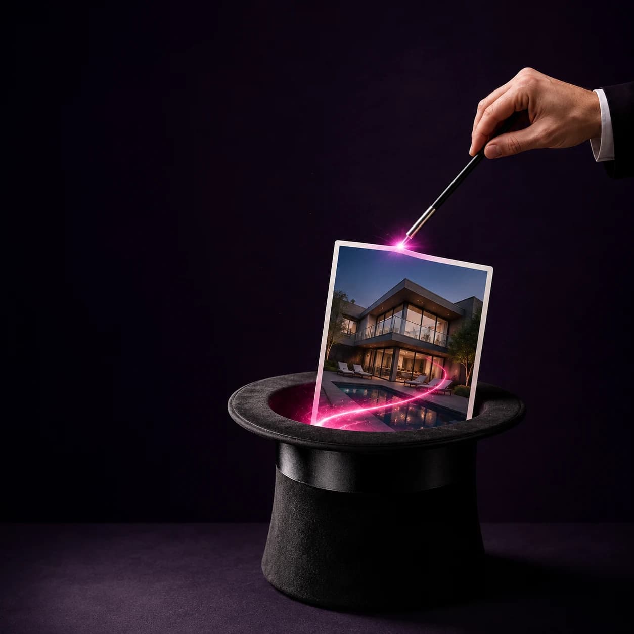

A credible property image or listing starts the story.
Hot pink appears briefly at the point of transformation.
The result resolves clearly. Motion and magic stop.
No: cartoon rendering, blue AI gradients, floating clutter, permanent fairy character, gender-coded styling, rainbow/star homage, or words baked into generated imagery.
06Voice
Set up a real realtor question. Let EffinMagic land the punchline.
Rooms, photos, copy, marketing, versions, approvals, finals.
Dry contrast works. A pile of punchlines does not.
Costs, errors, disclosure, property truth, and recovery are joke-free.
“Create real-estate marketing assets.”
“How'd you do all that?”
“EffinMagic.”
“Wave your wand and poof your listing into fabulousness!”
Stage. Fix. Write. Market. Bring the listing. Pick the finals. Also handled. Barely a production.
AI-powered. Magic workflow. Make-believe. Glow-up. Fabulous. Unicorn. Seamless solution. Not tech savvy.
07Product architecture
Present the rooms.
Improve the images.
Create the listing copy.
Make and deliver the campaign.
08In use
How'd you get
all that done?
87 Seaview DriveOriginals stay intact. You choose what goes out.
09Trust + access
Magic describes ease. It never invents facts, rooms, structures, views, or approvals.
Virtually staged outputs stay clearly identified wherever the workflow requires it.
AA contrast, 44 px touch targets, visible focus, useful alt text, and reduced motion.
The chore can be funny. The agent, seller, home, error, charge, and recovery never are.
“The magic is how it feels. The property stays true.”